Document
type:
stringTitle of the document, also used as the document unique identifier. If no route parameter is specified, the title is used to generate the document url. This is the only required field, as it is used to show the document in the menu structures.
---title: Library/Components/Button---
export default {title: 'Library/Components/Button',}
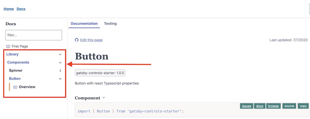 document title
type: DocType
Document type - blogs, pages, stories, and even custom ones. By default, all documents are of type
storyAll documents of the same type are grouped for easier search and navigation.
type:
numberDocument order used to sort between documents within the same parent menu. By default, documents are ordered by their filesystem precedence (alphabetically).
The order is used for the menu display as well as next/previous page navigation.
as an example, let's suppose you have the following 3 documents:
// first.mdx---title: Components/One---// second.mdx---title: Components/Two---// third.mdx---title: Components/Three---
From the file-system order, the documents will be ordered first.mdx, second.mdx and third.mdx (ordered by their file name alphabetically). However, we can order the files manually and sort them first.mdx, third.mdx and second.mdx.
// first.mdx---title: Components/Oneorder: 0---// second.mdx---title: Components/Twoorder: 2---// third.mdx---title: Components/Threeorder: 1---
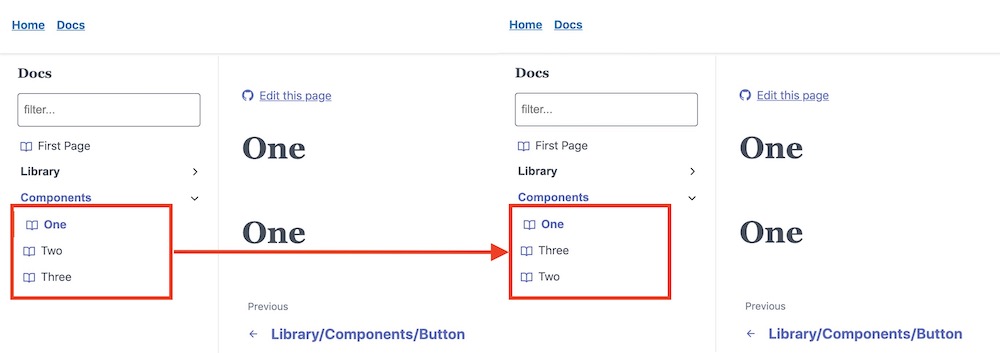 document order
type:
stringIf provided, will be used as the route for the document page. By default, the title in lowercase will be used as the route.
---title: Library/Components/Spinnerroute: /library/my-route---
export default {title: 'Library/Components/Button',route: '/library/esm-route',};
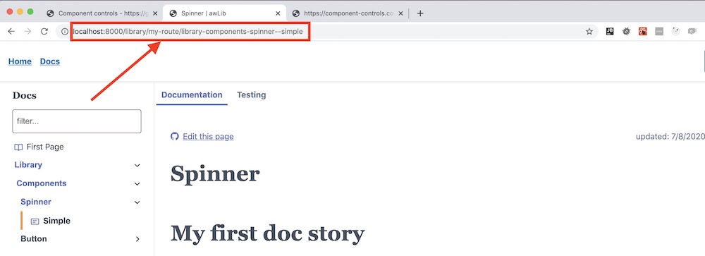 document route
type:
stringShort description of the documentation page - can be an excerpt for blog posts or keywords for the full-text search. If the description is set, it will also be used for SEO purposes as the description meta tag of the page.
---title: Library/Components/Spinnerdescription: this is a spinner documentation page---
export default {title: 'Library/Components/Button',description: 'this is a button documentation page'};
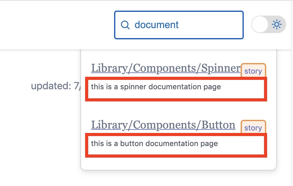 document description
type:
DateOptional date when the document was created. If not assigned, the instrumentation process will use birthtime from the filesystem.
---title: Library/Components/Spinnerdate: 01/01/2020---
export default {title: 'Library/Components/Button',date: new Date('01/01/2020'),};
type:
DateOptional date when the document was last modified. If not assigned, the instrumentation process will use mtime from the filesystem.
---title: Library/Components/SpinnerdateModified: 01/01/2020---
export default {title: 'Library/Components/Button',dateModified: new Date('01/01/2020'),};
type:
draft | publishedIf set to draft, the document will be hidden in production builds. This allows you to work on the draft version of a document without publishing it.
---title: Library/Components/Spinnerstatus: draft---
export default {title: 'Library/Components/Button',status: 'draft',};
type:
string[]List of document tags, used for cross-linking documents and the full-text search.
---title: Library/Components/Spinnertags:- documentation- components---
export default {title: 'Library/Components/Button',tags: ['documentation', 'components' ],};
 document tags
type:
stringDocument author. Allows categorizing documents by author and also creating custom author's home page.
---title: Library/Components/Spinnerauthor: atanasster---
export default {title: 'Library/Components/Button',author: 'atanasster',};
type:
stringCategory for the document, for example used by the addon-catalog to display components by category ie 'Display', 'Input' etc.
---title: Library/Components/Spinnercategory: Display---
export default {title: 'Library/Components/Button',category: 'Display',};
type:
booleanWhether to add a sidebar to navigate all the documents from the same document type. The default value is from the document type configuration but can also be changed at the document level.
---title: Library/Components/SpinnernavSidebar: false---
export default {title: 'Library/Components/Button',navSidebar: false};
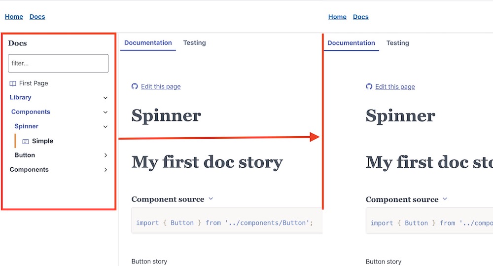 document navSidebar
type:
booleanWhether to add a context sidebar to access the sections on the current page. The default value is from the document type configuration but can also be changed at the document level.
---title: Library/Components/SpinnercontextSidebar: false---
export default {title: 'Library/Components/Button',contextSidebar: false,};
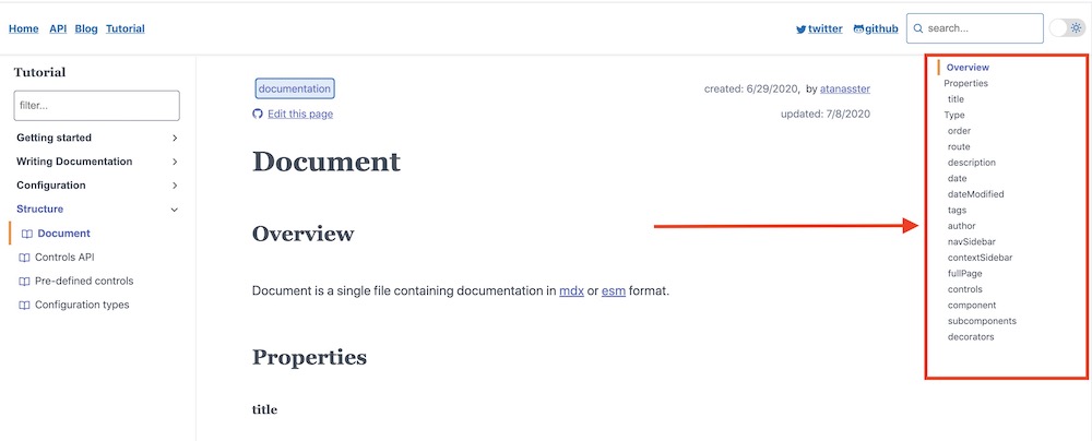 document context sidebar
type: `boolean
Whether the page to use the full-page theme styling (pagecontainer.full theme variant can be customized). The default value is from the document type configuration but can also be changed at the document level.
---title: Library/Components/SpinnerfullPage: true---
export default {title: 'Library/Components/Button',fullPage: true,};
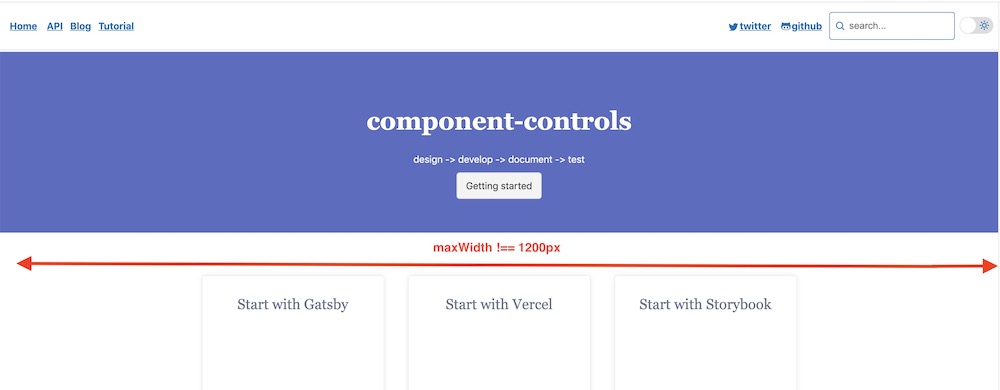 document fullPage
type:
string | objectThe component associated with the documentation page.
---title: Library/Components/Spinnercomponent: Button---import { Button } from '../components/Button';import { PropsTable, ComponentSource } from '@component-controls/blocks';## Component Component<ComponentSource of="." />## Component Props<PropsTable of="." />
import { Button } from '../components/Button';export default {title: 'Library/Components/Button',component: Button,};
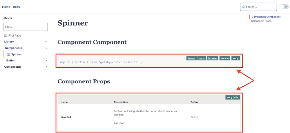 document component
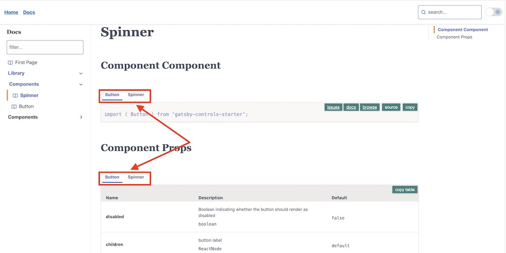
type: `string[] | object[]
Multiple components option.
---title: Library/Components/Spinnercomponent: Buttonsubcomponents:- Spinner---import { Button } from '../components/Button';import { Spinner } from '../components/Spinner';import { PropsTable, ComponentSource } from '@component-controls/blocks';## Component Component<ComponentSource of="." />## Component Props<PropsTable of="." />
import { Button } from '../components/Button';import { Spinner } from '../components/Spinner';export default {title: 'Library/Components/Button',component: Button,subcomponents: [Spinner]};
 document subcomponents
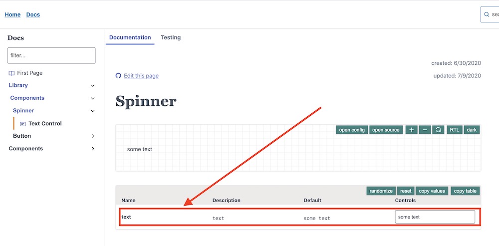
type: ComponentControls
An object of key/value pairs specifying the controls for the stories file will apply to all the stories in the file.
---title: Library/Components/Spinnercontrols: { text: 'some text' }---import { Playground, Story, PropsTable } from '@component-controls/blocks';<Playground><Story name="text-control">{({ text }) => (<div>{text}</div>)}</Story></Playground><PropsTable name="text-control" />
import React from 'react';export default {title: 'Library/Components/Button',controls: { text: 'some text' },};export const textControls = ({ text }) => <div>{text}</div>;
 document controls
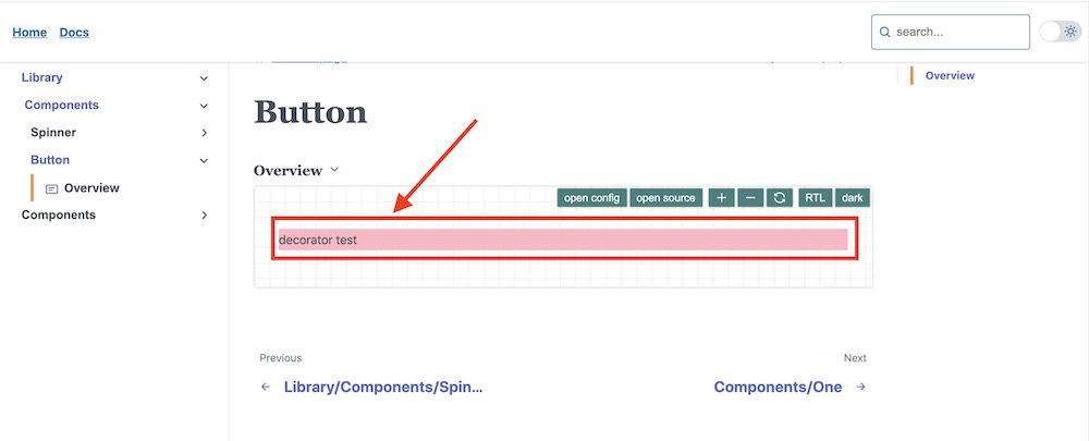
type StoryRenderFn[]
An array of wrapper functions (decorators) that will be called when rendering each story.
import React from 'react';export default {title: 'Library/Components/Button',decorators: [(controls, context) => {const { renderFn } = context;return (<div style={{ background: 'lightpink' }}>{renderFn(controls, context)}</div>);},],};export const overview = () => <div>decorator test</div>;
 document decorators
type: `string[]
associate component test files with the document, the paths sould be relative to the document file. By default the associated test files are inferred automatically.
import { Button } from '../components/Button';export default {title: 'Library/Components/Button',component: Button,testFiles: ['./Button.test.ts']};
type: `string[]
associate component files to include in the coverage testing, the paths sould be relative to the document file. By default the associated coverage files are inferred automatically.
import { Button } from '../components/Button';export default {title: 'Library/Components/Button',component: Button,testCoverage: ['./Button.ts', '../utils.ts']};
type: `string
associate a data-driven testing file component, the path sould be relative to the document file. By default the associated data-driven testing file is inferred automatically.
import { Button } from '../components/Button';export default {title: 'Library/Components/Button',component: Button,testCoverage: ['./Button.ts', '../utils.ts']};