External libraries
component-controls has extensive support to document libraries that are not residing in the same repository as the documentation.For the purposes of this tutorial, we will follow the steps necessary to configure a documentation site for the theme-ui library.
The accompanying site for this tutorial can be found here: live site with full source
component-controls follows the component imports even into external packages installed in node_modules.Let's create a simple ESM story file without any changes to the configuration. We can import the
Button component from theme-ui and assign it as the component property of the document.External library imports are usually resolved to their
dist(distribution) folder - in this case, the theme-ui import will be resolved to the node_modules/theme-ui/dist/index.js file.import React from 'react';import { Button } from 'theme-ui';export default {title: 'Components/Button',component: Button,};export const overview = () => <Button>theme-ui</Button>;
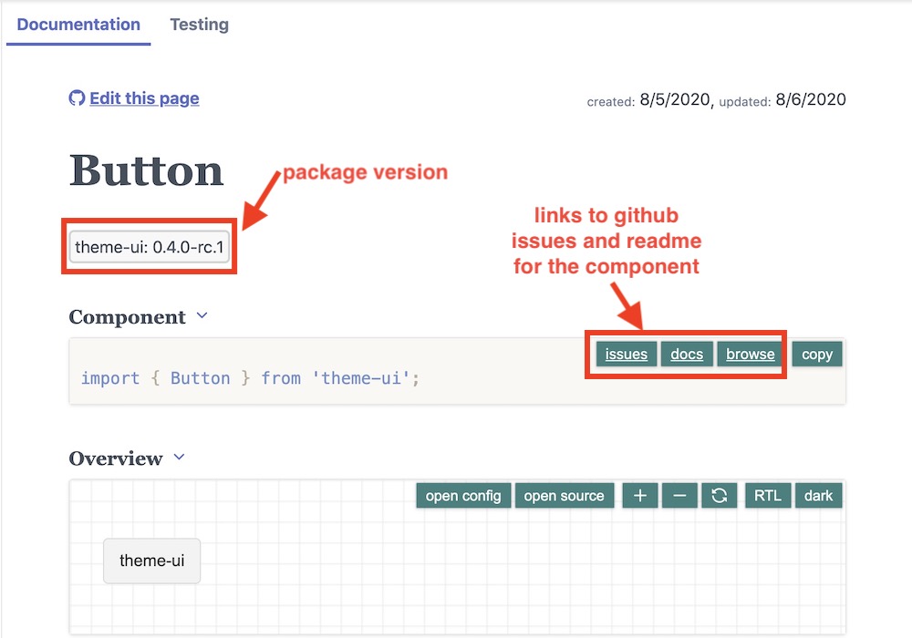
This automatically displays some component information such as the package version, and eventual links to the component's repository:
 external library with basic configuration
Since a
dist/index.js file does not actually exist in the repository (and theme-ui does not provide full package repository location information), we can hide that link from the UI with a custom configuration of the instrumenting process:.config/buildtime.js
module.exports = {instrument: {components: {package: {browseLink: false,},},}};
or better - we can point to the correct repository source location
.config/buildtime.js
module.exports = {instrument: {components: {package: {browseLink: (componentName, filePath ) => {if (filePath.includes('system-ui/theme-ui/tree/master/dist/index.js')) {return `https://github.com/system-ui/theme-ui/tree/master/packages/components/src/${componentName}.js`}return filePath;}},},}};
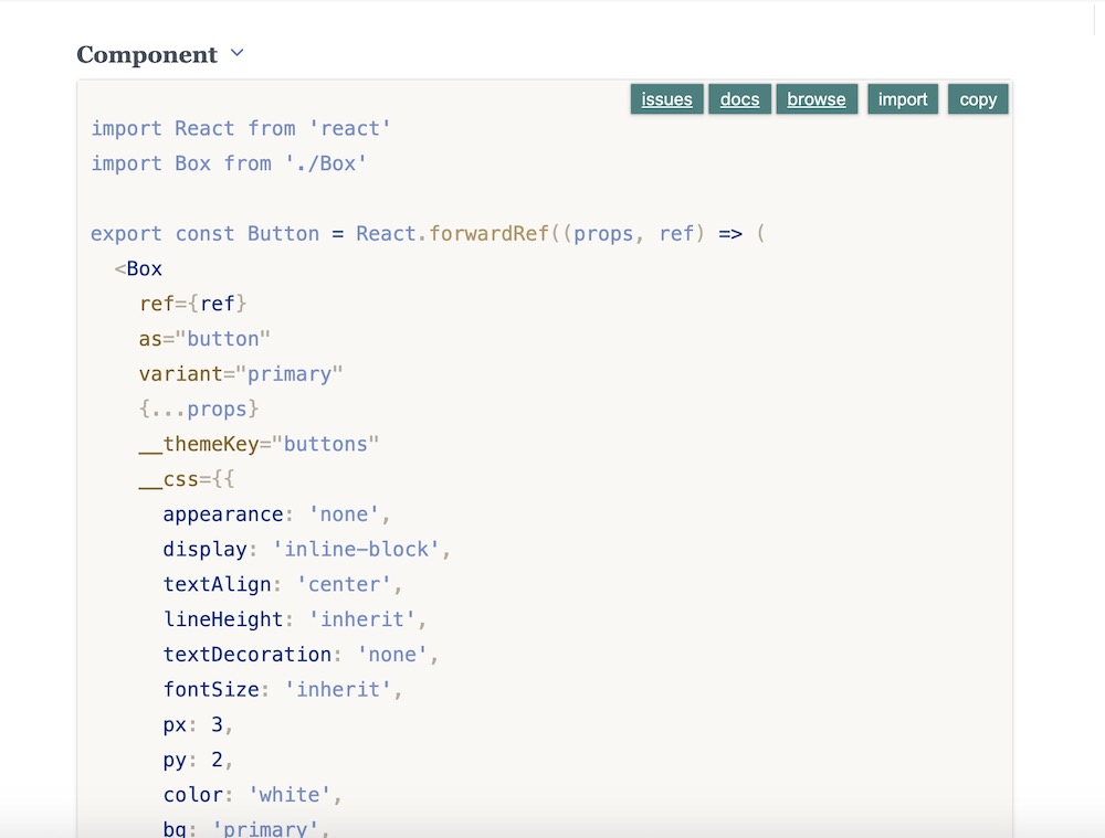
At this point, if you click on the
source button in the component's source block, we will see the content of the entire node_modules/theme-ui/dist/index.js file, since that is where importing theme-ui resolves:import { Button } from '@theme-ui/components';
Since
theme-ui also installs the source files for each individual component in node_modules/@theme-ui/components/src/[componentName].js, we will configure the instrumenting process to find the individual components source files:.config/buildtime.js
const path = require('path');module.exports = {instrument: {components: {package: {browseLink: (componentName, filePath ) => {if (filePath.includes('system-ui/theme-ui/tree/master/dist/index.js')) {return `https://github.com/system-ui/theme-ui/tree/master/packages/components/src/${componentName}.js`}return filePath;}},resolveFile: (componentName, filePath) => {if (filePath.includes('theme-ui/dist')) {const resolved = path.resolve(path.dirname(filePath),`../../@theme-ui/components/src/${componentName}.js`,);return resolved;}return filePath;},},}};
With the above configuration, we should be able to view the source code of the
Button component, as installed in node_modules/@theme-ui/components/src/Button.js: external library source code config
Unfortunately the individual
theme-ui component files do not contain the component's properties information and we will configure this feature next. For theme-ui, we need to point the instrumenting module to the typescript interfaces for the component props and they can be found in node_modules/@theme-ui/components/index.d.ts. .config/buildtime.js
const path = require('path');module.exports = {instrument: {components: {package: {browseLink: (componentName, filePath ) => {if (filePath.includes('system-ui/theme-ui/tree/master/dist/index.js')) {return `https://github.com/system-ui/theme-ui/tree/master/packages/components/src/${componentName}.js`}return filePath;}},resolveFile: (componentName, filePath) => {if (filePath.includes('theme-ui/dist')) {const resolved = path.resolve(path.dirname(filePath),`../../@theme-ui/components/src/${componentName}.js`,);return resolved;}return filePath;},resolvePropsFile: (componentName, filePath) => {if (filePath.includes('@theme-ui/components/src')) {const resolved = path.resolve(path.dirname(filePath),`../index.d.ts`,);return resolved;}},},}};
As a result, we should now see a full PropsTable for the
Button component populated automatically with rich properties information generated by react-docgen-typescript.Name | Description | Default | |
|---|---|---|---|
BoxOwnProps(4 properties) | |||
| as | ElementType<any> | - | |
| variant | string | - | |
| css | Interpolation<any> | - | |
| sx | ThemeUIStyleObject | - | |
SpaceProps(28 properties) | |||
ButtonHTMLAttributes(11 properties) | |||
HTMLAttributes(44 properties) | |||
OpacityProps(1 properties) | |||
AriaAttributes(48 properties) | |||
DOMAttributes(161 properties) | |||
Attributes(1 properties) | |||
BackgroundColorProps(2 properties) | |||
RefAttributes(1 properties) | |||
As well as the component's dependencies table:
package | imports | peer |
|---|---|---|
@emotion/react ^11.1.1 | Interpolation | |
@emotion/styled ^11.0.0 | StyledComponent | |
@theme-ui/css 0.8.4 | ThemeUIStyleObjectResponsiveStyleValue | |
react ^17.0.1 | namespace | * |
styled-system | SpacePropsMarginPropsColorProps |
Now that we have configured the external library's source locations, we can create extensive documentation using ESM and MDX formats and play with the controls to adjust visually the properties.
Name | Description | Default | Controls |
|---|---|---|---|
| variant | ControlTypes.OPTIONS | primary | Invalid Type |
| text | text | theme-ui |