Migration from Storybook 6 - Nextjs
The starting sample project was cloned from
The final project can be found here:
yarn add next emotion@10.0.27 emotion-server@10.0.27 @emotion/core@10.1.1 @component-controls/nextjs-plugin -D
component-controls has two configuration files - one is used during build-time in a nodejs environment, the other is used during run-time in a browser environment.
The rough equivalents of Storybook for those two configuration files are
main.js and preview.(js|ts)You can keep the
main.js Storybook configuration file and rename preview.ts to runtime.tsx:.storybook/main.js
module.exports = {stories: ['../src/**/*.stories.@(js|jsx|ts|tsx|mdx)'],// remove all storybook addons};
.storybook/runtime.tsx
// empty file
By default, the Storybook configuration file is kept in a folder name
.storybook, while component-controls uses a .config folder. We will configure the nextjs plugin in next.config.js.next.config.js
const withStories = require('@component-controls/nextjs-plugin/build');module.exports = withStories({future: {webpack5: true, //use webpack 5 for nextjs},configPath: '.storybook',});
The component-controls nextjs plugin needs to be set up with page templates in a
pages folder of your projectmkdir pages
You can either copy the pages from this github repo or follow the getting started with nextjs tutorial.
pages/_app.js
import React from 'react';import NextApp from 'next/app';import '../src/tailwind.output.css';export default class App extends NextApp {render() {const { Component, pageProps } = this.props;return <Component {...pageProps} />;}}
Next, you should add the gatsby develop and gatsby build scripts to the project's
package.jsonpackage.json
"scripts": {..."tailwind:watch": "postcss ./src/styles/tailwind.css -o ./src/tailwind.output.css --watch","docs:build": "next build && next export","docs:start": "next -p 6006","lint": "eslint \"./src/**/*.{ts,tsx,js,jsx}\"",...},
At his point, you can start your documentation site
yarn docs:start
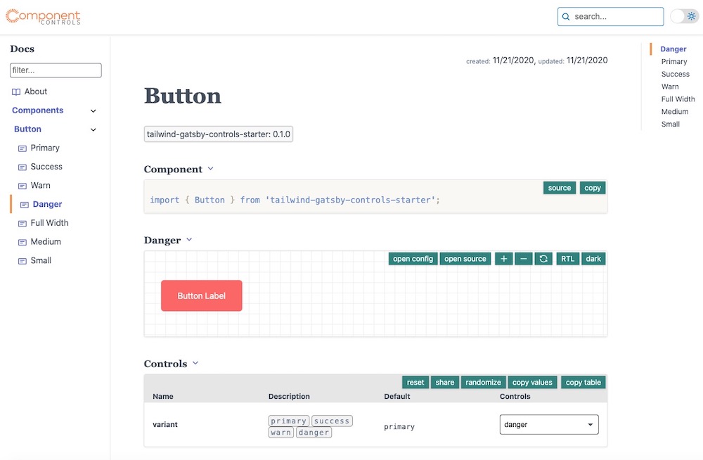
And a new documentation site should be up and running
 gatsby site
You can configure the name, site and various other site parameters for the new documentation site
.storybook/main.js
module.exports = {stories: ['../src/**/*.stories.@(js|jsx|ts|tsx|mdx)'],siteUrl: 'https://tailwind-gatsby-controls-starter.netlify.app',};
.storybook/runtime.tsx
import { RuntimeConfiguration } from '@component-controls/core';const config: RuntimeConfiguration = {analytics: 'UA-XXXXXXXXX-X',title: `Tailwind component-controls`,description: `Tailwind project with typescript, react testing library and component-controls`,author: `@component-controls`,};export default config;
component-controls allows adding fully customizable documentation pages to your site and comes with package of pre-configured pages.
.storybook/main.js
const { defaultBuildConfig } = require('@component-controls/core');module.exports = {stories: ['../src/**/*.stories.@(js|jsx|ts|tsx|mdx)'],siteUrl: 'https://tailwind-gatsby-controls-starter.netlify.app',pages: {story: {tabs: {...defaultBuildConfig.pages.story.tabs,test: '@component-controls/pages/TestingPage',},},},};
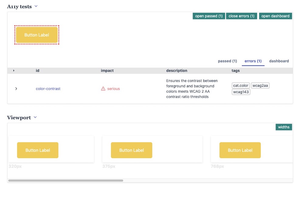
The new Testing Page should now be visible
 testing page
The
@component-controls/cc-cli package is automatically creating jest snapshot tests from your existing stories. It has an easy to use command-line interface that we will use in this example but also offers a fully customizable API.yarn add @component-controls/cc-cli -D
We will launch the
cc-cli command-line tool to create automatically tests for all our existing stories.package.json
{"name": "tailwind-storybook-controls",..."scripts": {"start": "react-scripts start","build": "react-scripts build","test:create": "cc-cli -c ./.config -o tests -t stories.test.ts -n components -f ts","test": "yarn jest""eject": "react-scripts eject",...},...}
yarn test
Running the
test:create script test will a tests file stories.test.ts (typecript format) in the tests folder.After running the tests, you should have a file
tests/__snapshots__/stories.test.js.snap, with snapshots like this one:tests/__snapshots__/stories.test.js.snap
exports[`Components/Button Primary 1`] = `<DocumentFragment><buttonclass="rounded-md focus:outline-none focus:shadow-outline bg-primary-500 text-white hover:bg-primary-600 py-4 px-8"type="button">Button Label</button></DocumentFragment>`;